Crescendo Case Study
Springboard Capstone Project
Crescendo is a media streaming service in need of an app that allows users to upgrade to a premium (paid) version of the app.
UX Challenge
Crescendo is a startup company which launched a media product two years ago. It is a freemium model that has a mobile-web experience and a mobile app. The company’s business strategy was to first build a user base by offering a free product and then evolve the feature set so they could monetize on a premium (paid) product. At this point, the product has been well received and has a healthy user base of free users. They now need to design an experience that will allow users to subscribe and pay a monthly fee.

UX Solution
Direct existing users to upgrade and create opportunity for new users to opt into the paid version of the app upon registration.
My Role:
UX/UI Designer and Researcher
The Team: I was the sole UX Designer for this project
Tools Used: Figma, Miro
Timeline: 12 Days
Understand and Map
Through user research, interviews, and competitive analysis, I found features of a music streaming service that users would be most likely to pay for.
User interviews with a mix of males and females age 18-27 showed me that music listeners enjoy features like ad-free music, shared playlists, discoverability of new artist, and custom recommended music.
I designed a User Flow that indicates the route users will take when signing into the free version of the app. The flow shows where users will be prompted to upgrade to a paid, premium account.
Critical decision screens include:
The screen immediately after sign up for new users, which will display the pain plan options.
The home screen that shows music playlists, which will have buttons and pop-ups for upgrading.


Competitive Analysis
Before creating wireframes, I conducted a competitive analysis of other similar services.
Crescendo is a media streaming platform aiming to add a premium (paid) subscription to their already existing free version of the app. I completed an analysis of other media streaming services: Spotify, YouTube Music, and Pandora. This competitive analysis allowed me to:
Compare aesthetic and design of apps that allow users to consume media in both free and paid formats.
Identify the core features within a these app thats are relevant to allow user autonomy
Verify the areas of design that are important to user success


Wireframing
After conducting the competitive analysis and finishing initial user interviews, I designed wireframes for anticipated critical screens. These screens include alternate views of the current free version of the app versus the paid, premium version.

Initial Mockups
I completed 5 user tests with the wireframe design and concluded from the usability tests that there were 3 main elements of the design I wanted to focus on:
Creating a smooth transition from new sign-up to prompt for paid plans
2. Showing key differences between the free and premium versions of the app
3. Allowing several opportunities to upgrade
-
![media streaming service login]()
New users sign up
-
![app high fidelity mock-up]()
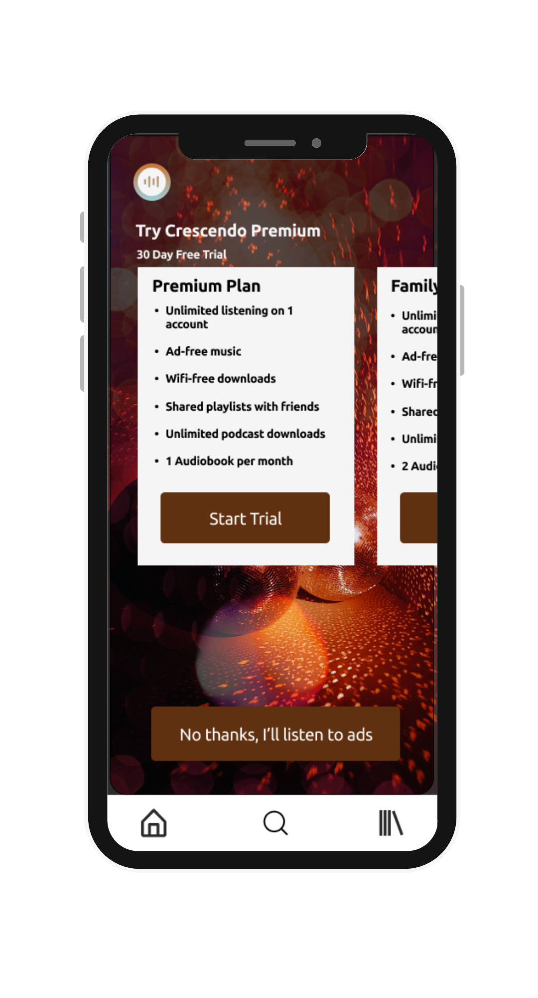
Paid plan options
-
![app high fidelity mockup]()
Stream for free
-
![]()
Stream premium


Testing and Validation
I continued to iterate designs in Figma after doing 5 more usability tests with users ages 18-24. From these tests I gained a few key insights:
The sign up process needed to be more customized
I got confirmation that most users would test a premium version if offered a trial
There needed to be even more opportunity for users to upgrade
Below are the second round of iterations for the Crescendo app, featuring added screens and screens that were significantly edited to meet user needs.
-
![remote workers app]()
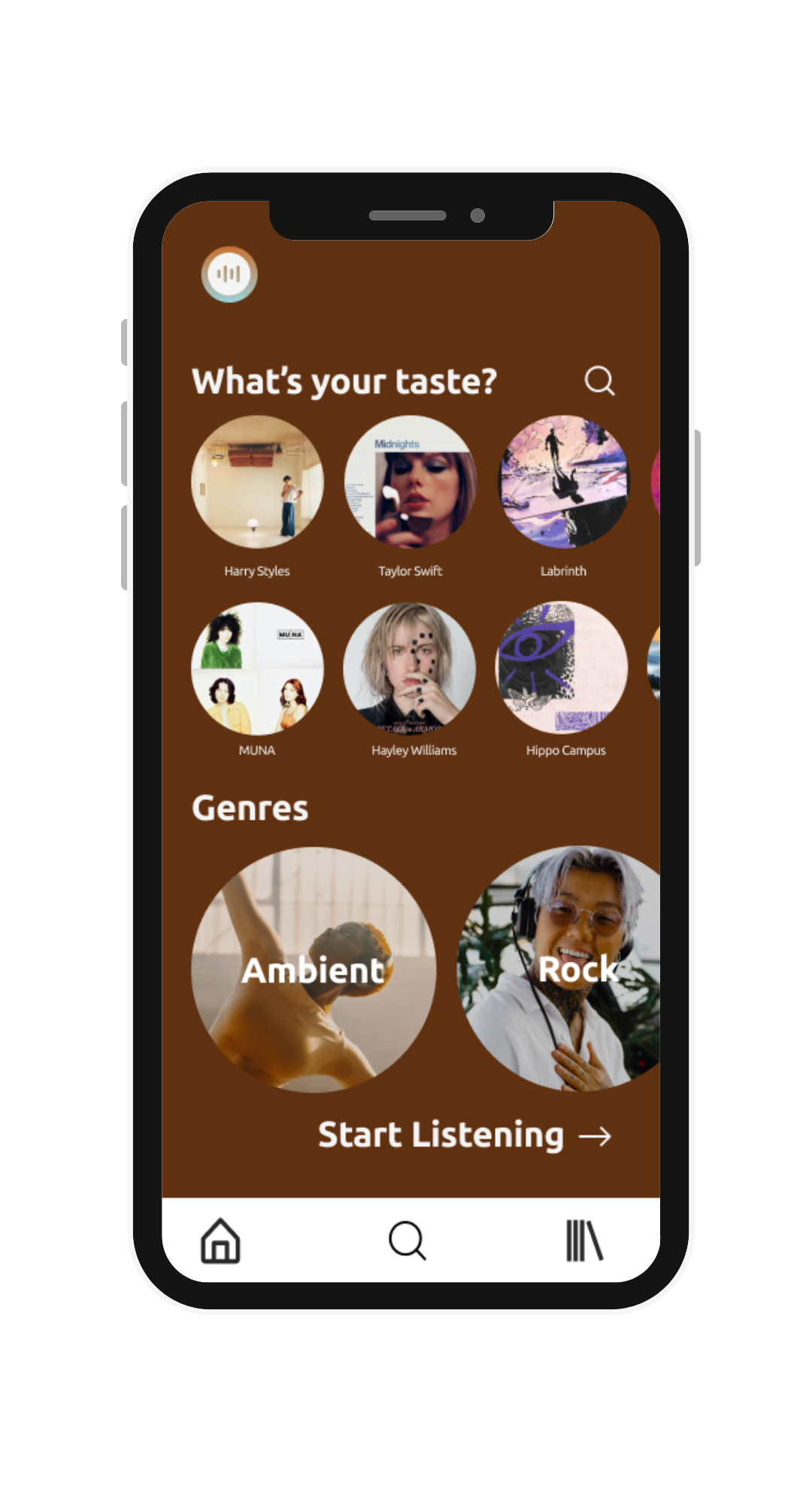
Select music preference
-
![app high fidelity mock-up]()
Paid plan options
-
![app high fidelity mockup]()
Stream for free
-
![]()
Ad-free music pop up
-
![]()
Listen with ads
-
![]()
Pop-up while listening


Interactive Prototype

If you’d like to access an interactive prototype of the Crescendo app design, click on the image or click HERE to launch.
Reflection & Next Steps
This project showed me a side of UX design that focuses more on encouraging users to complete a very specific task that will generate revenue and brand loyalty. This reiterated the importance of human-centered design and creating copy that engages users enough to act.
If given the opportunity to continue working on this project, I would love to design more iterations of screens for the premium version of the app–including a personalized playlist screen expanded, a “liked media” screen, and more screens that highlight the features users will pay for in the premium version of the app.