F45 Training Case Study
F45 Training is a functional fitness group training facility with multiple mobile apps. This is a Capstone project.
UX Challenge
Because F45 Training is a technology-focused studio, members are required to have multiple mobile apps. According to interviews and research, users desire more simplicity and efficiency. We are aiming to answer this question: How might we make the use of our apps easier and more efficient for members?

UX Solution
Re-design the current F45 Training booking app to add features that allow users to perform multiple actions all in one place. For the sake of this project, we focus on the “booking” feature.
My Role:
UX/UI Designer and Researcher
The Team: I was the sole UX Designer for this project
Tools Used: Figma, Adobe XD
Timeline: 8 weeks
Platforms: Mobile
Understand and Map
Through user research, interviews, and competitive analysis, I was able to pinpoint some of the most important aspects of a mobile app for a fitness facility.
Preliminary research began with reading articles from fitness industry professionals and health coaches that pointed out reasons WHY people often quit their fitness journeys. The use of technology seemed to play a large role in helping people stay motivated.
In addition to this research, I completed a competitive analysis of Orangetheory, Barry’s Boot Camp, and Pure Barre, which is expanded further in this case study.
I also completed 10 user interviews with current gym members of F45 Training and competitor gyms which allowed me to understand what is most important to gym goers as they navigate the intersection of technology and fitness.


Competitive Analysis
F45 Training is one of many global fitness facilities that use mobile app booking systems for their gym members. This competitive analysis allowed me to:
Compare aesthetic and design on some of the top performing fitness facility mobile apps
Identify the core features within a gym app that are relevant to allow user control and freedom
Verify the areas of design that are important to user success


User Flow
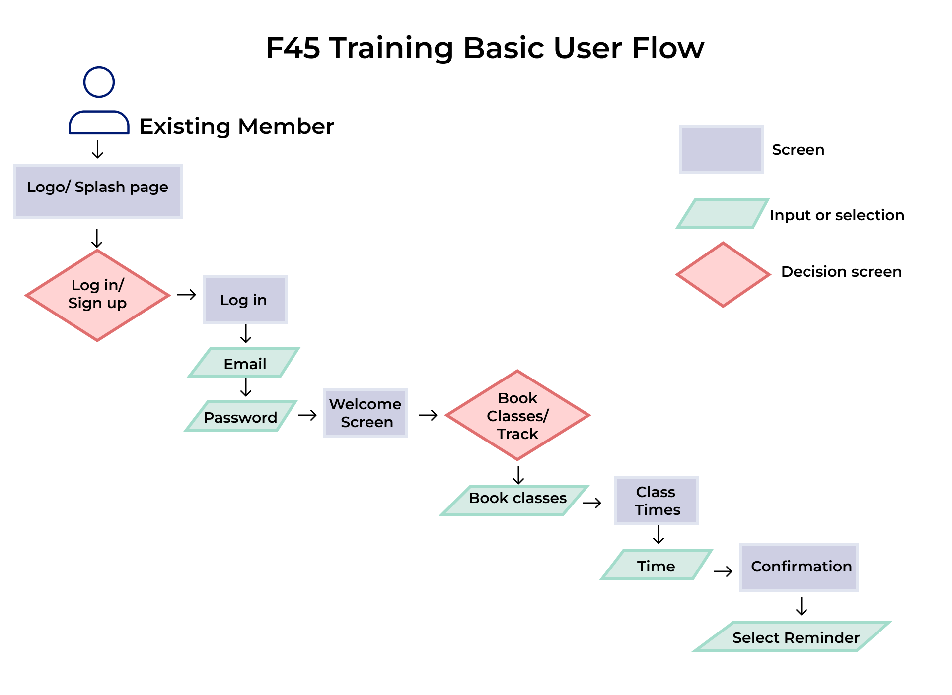
“As a gym member, I want to book my classes in advance, so that I’m guaranteed a spot in class when I arrive.”
“As a gym member, I want to track my fitness progress on my phone, so that I can hold myself accountable.”
“As a gym member, I want to easily schedule my favorite class times and set reminders so that my schedule is set in an efficient way.”
The user flow designed for the F45 Training mobile app minimal viable product (MVP) was based on three user stories that defined the most likely user needs. The user flow assumes the app user is an existing member of the gym.
Design Process
With the completed user research and information acquired from interviews, I created sketches and low-fidelity mockups of F45 Training’s mobile app in Figma. As previously mentioned, the focus was on designing an efficient booking system.

Design Inspiration
Images were chosen and screenshots of other designs were taken to inspire the design process for high-fidelity mockups. Some of the words chosen to describe the vision for the design were: motivating, challenging, inspiring.

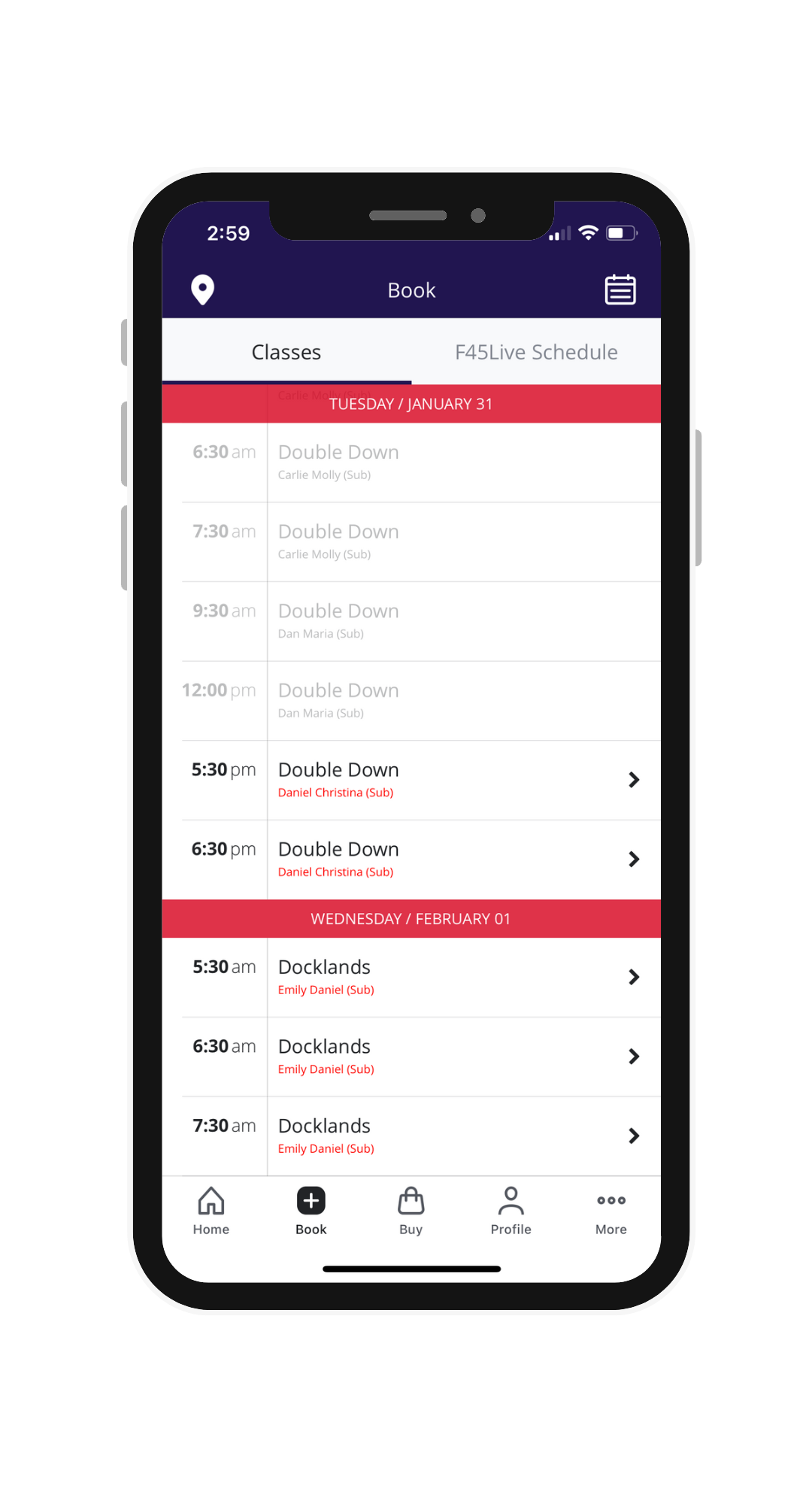
Before Re-Design
F45 Training is an existing fitness brand. For the sake of this school project, I re-designed portions of their app to develop a more efficient and user-friendly version of the booking process. The following screenshots are from the existing app, before the re-design.
-
![Gym app booking screen]()
Booking Screen
-
![Gym app high fidelity mock-up]()
Booking Explanation
-
![Fitness app high fidelity mockup]()
Booking Confirmed Screen

After conducting usability tests with current gym members, I translated findings into high fidelity designs. Users gave feedback such as wanting to see more dates, wanting to be able to distinguish clearer which class and coaches they were booking into, and wanting more clarity on the confirmation screen.
I iterated my designs according to user feedback. Some of the key changes included modifying text size for better accessibility on the “Booking Classes” screen, adding a calendar capability that allows users to view larger date ranges than what was included in the initial designs (also on the “Booking Classes” screen), and modifying the initial “Confirm Booking” screen to include the exact date and time as a reminder of what class the user is booking into.
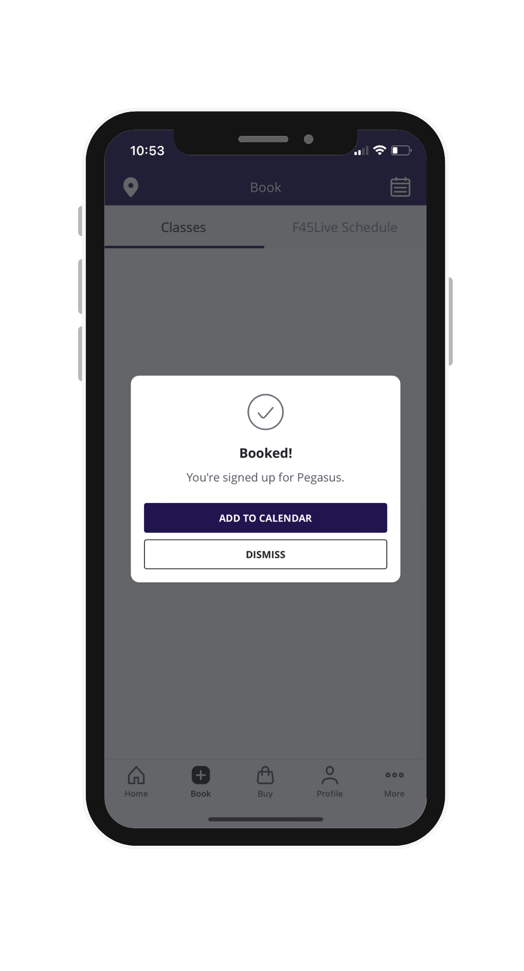
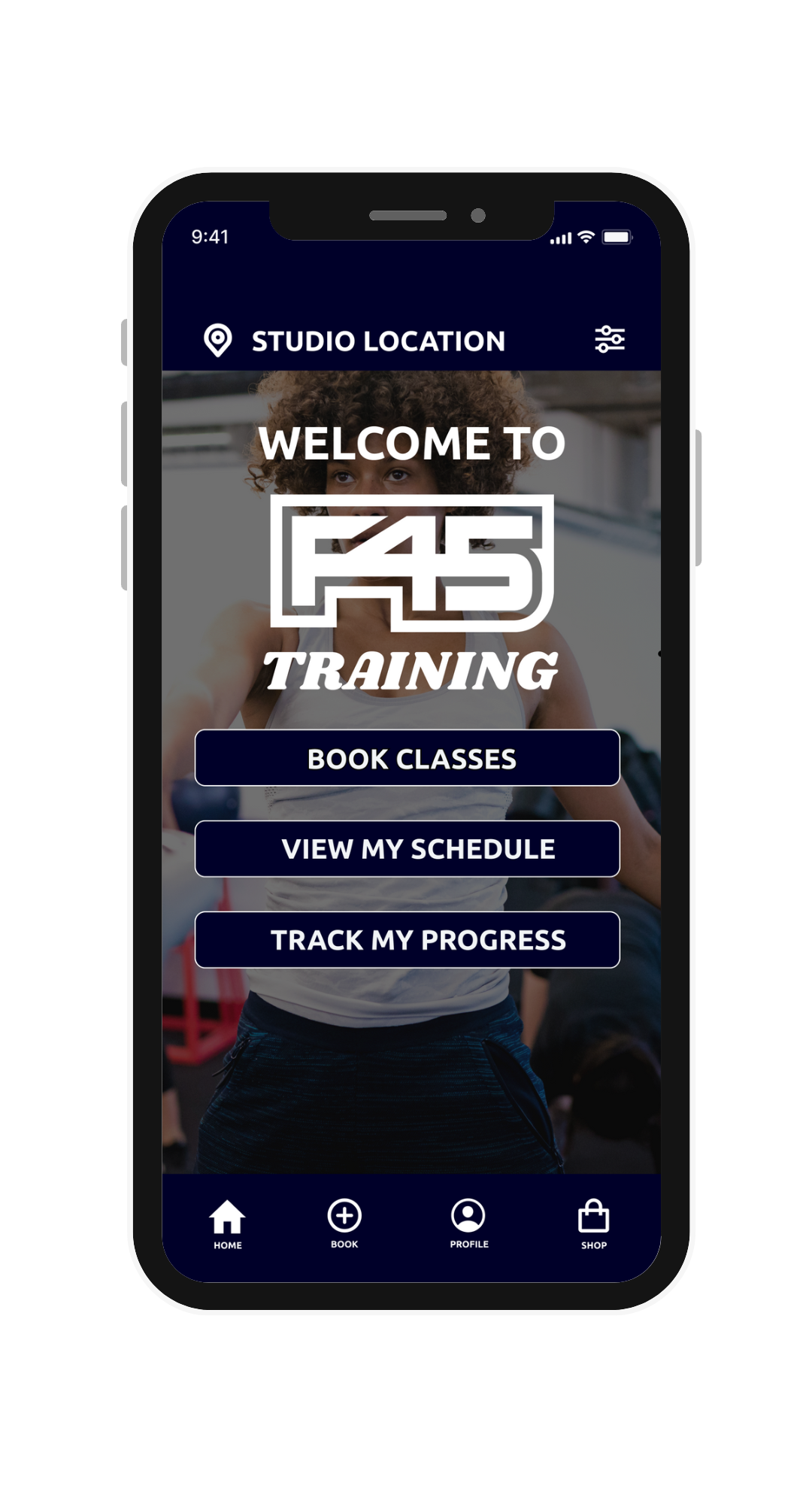
High Fidelity Mockups : After Re-Design
-
![Gym app home screen design]()
Home Screen
-
![gym app booking classes design screen]()
Booking Classes Screen
-
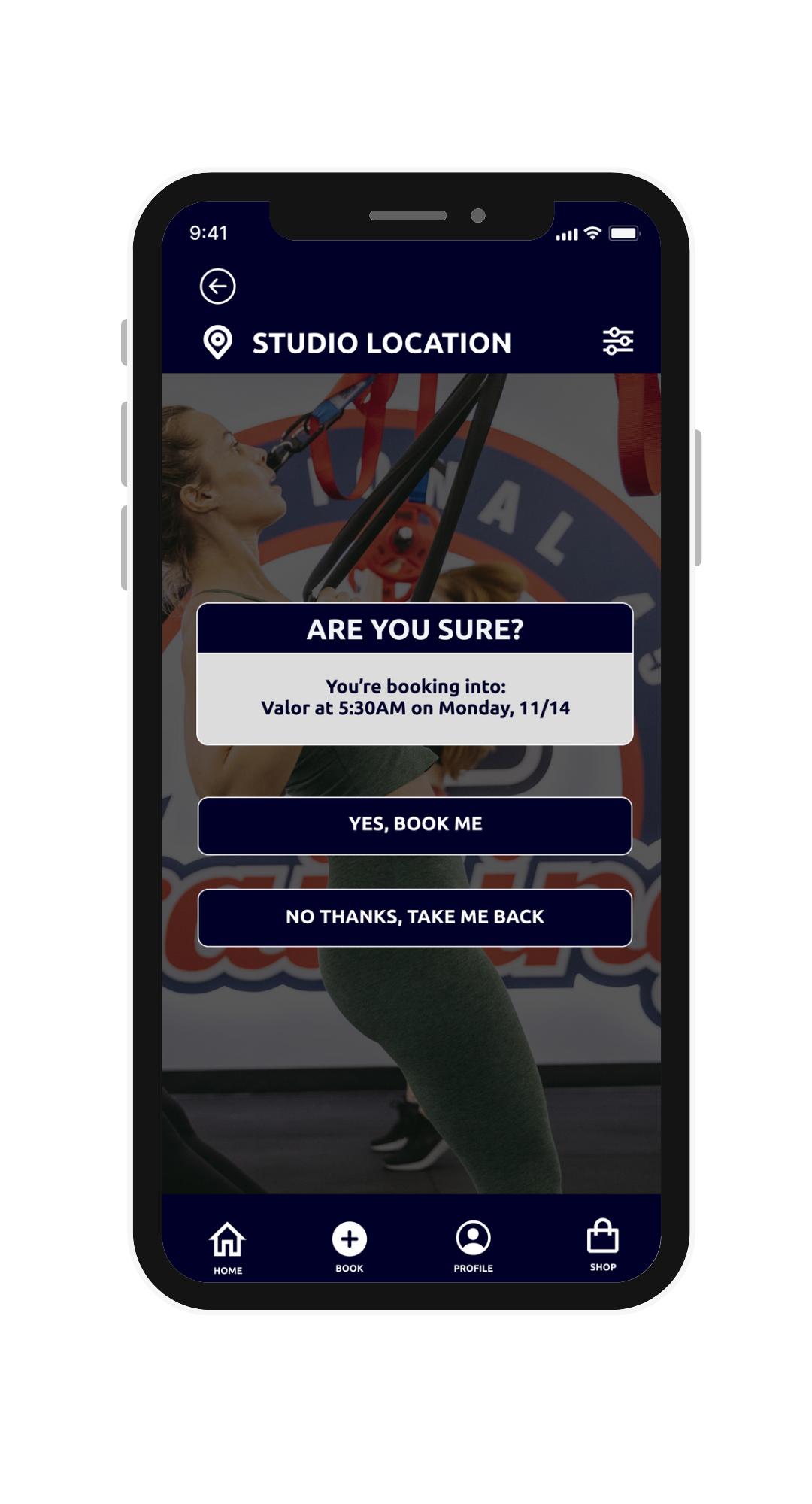
![]()
Confirm Booking Screen
-
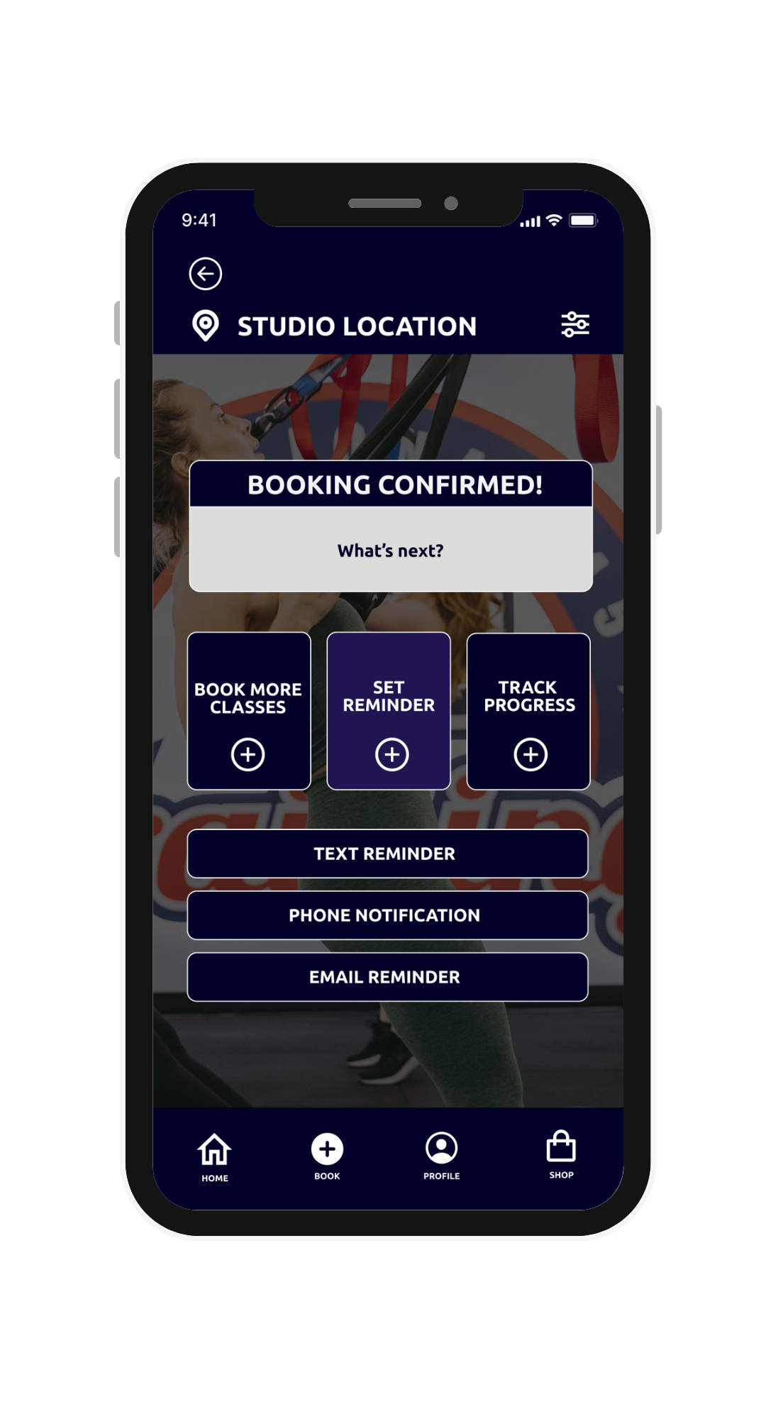
![]()
Set Reminder Screen
-
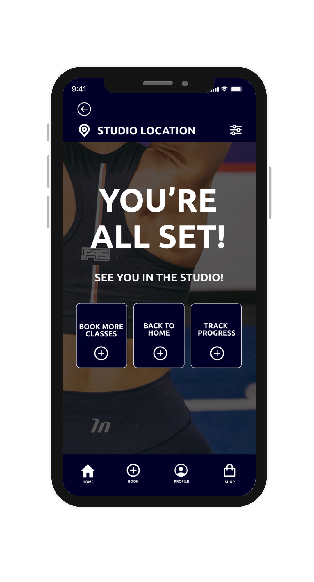
![]()
End Booking Screen
Interactive Prototype
If you’d like to access an interactive prototype of F45 Training’s app re-design, click on the image or click HERE to launch.

Reflection & Next Steps
This project reiterated to me the importance of efficiency in design. Even the smallest details in a button or font size make all the difference in a great design versus a good one. I also realized it’s ok to “break the norm” with certain aspects of design. Even in a larger, established company, changes and improvements can always be made to elevate a user experience. After conducting several rounds of research and implementing multiple iterations of designs for the F45 Training app, three main conclusions have been made from this project:
Users want to distinctly see the actions they are taking on the app.
Users want options and flexibility. They desire autonomy.
Users need reassurance along with guidance.
Next steps would include designing and prototyping more user journeys through the different app features to make sure they are intuitive and efficient.