PostUp Case Study
Google Ventures Design Sprint
PostUp is an online forum for freelance and remote workers share tips and advice about the industry and jobs.
The Challenge
PostUp has noticed a lot of conversation around the struggles remote workers face when trying to find public workspaces. The company wants to allow paying members of their service to have easier access potential work spaces. My goal was to answer this question: How might we make it easier for remote workers to find public places and coffee shops where they can work?

The Vision
Build a new, highly interactive search feature that will be added to the PostUp app allowing users to find public spaces to work from in their areas.
My Role:
UX/UI Designer and Researcher
The Team: I was the sole UX Designer for this project
Tools Used: Figma, Miro
Timeline: 5 Days
Platforms: Mobile
Day 1: Understand and Map
Through user research, interviews, and competitive analysis, I was able to articulate some of the most prominent needs of remote workers when trying to find a location to work from.
Initial research was given to me at the start of this project which offered pre-defined personas and listed quotes from a few user interviews. From this research, I designed a User Map which shows the important steps a user needs to take in order to find a remote work location.
After reviewing research and creating the user map, I understood that the most crucial elements of this app and design were the following:
Filters to allow refined searched for places with wifi, bathrooms, outlets, low noise levels, comfortable seating, etc.
A map feature to use as a search tool
Capability to view photos and reviews from other PostUp users
A mix of offerings from coffee shops to other public spaces


Day 2: Sketch
Lightning Demos
Before sketching, I conducted lightning demos to review other similar apps. This was chosen as a condensed competitive analysis due to the time constraint of this project.
PostUp is currently a social community wanting to better serve their users through the ability to connect them with resources to find remote working locations. With this in mind, I completed an analysis of other apps with detailed search engines: Airbnb, AllTrails, and Yelp. This competitive analysis allowed me to:
Compare aesthetic and design of apps that allow users to complete detailed searched for places and experiences.
Identify the core features within a these app thats are relevant to allow user control and freedom
Verify the areas of design that are important to user success
Below is a summary of findings from the Lightning Demo Competitive Analysis

Solution Sketches
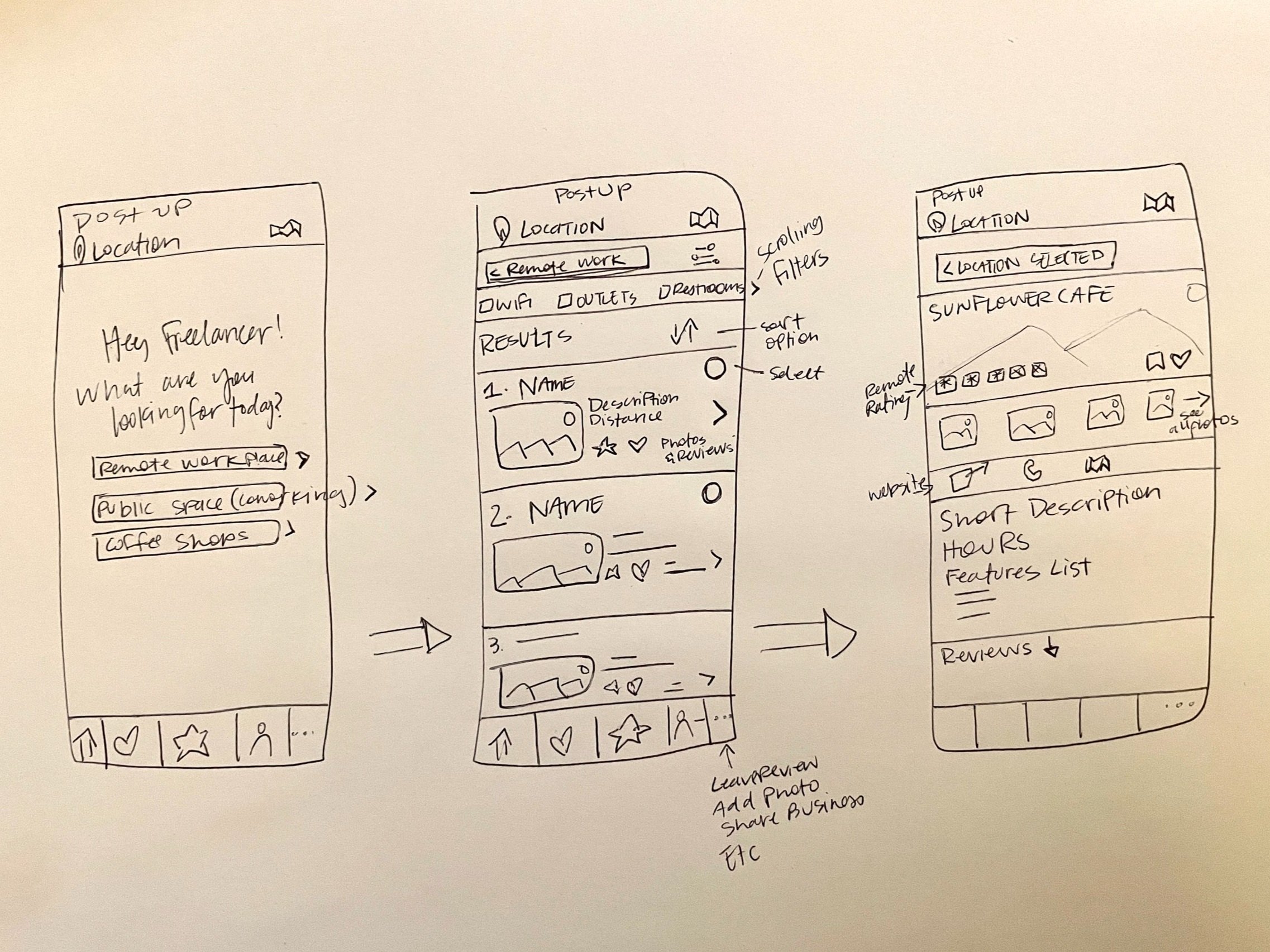
After conducting the competitive analysis, I completed a sketch exercise called “Crazy 8’s” where I sketched 8 possible designs for my most critical screen in 8 minutes. For this design sprint, it was critical I use time efficient methods to reach design solutions. From this exercise, I chose the most ideal design and expanded it into a mini storyboard. I sketched (1) the screen that comes before my critical screen, (2) the critical screen itself, and (3) the screen that comes after my critical screen. Doing these 3 main screens allowed me to condense the sketch process, but still focus on critical elements needed for the design.

Day 3: Decide

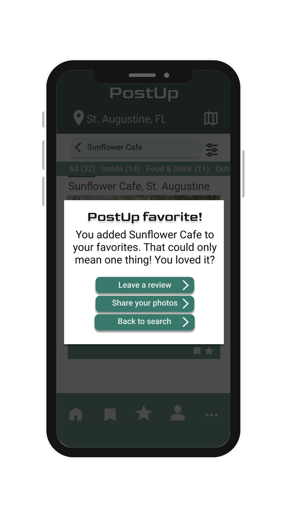
On day 3, I designed a multi-paneled storyboard depicting actions a user will actually take within the PostUp app. As shown, a user goes from clicking that they want to work in a coffee shop all the way to selecting it (adding their choice to a favorites list). They have options to click on reviews and other images that other PostUp users have left. In addition, if the user adds a place to their favorites, they are prompted to leave a review or photo in return.
Day 4: Prototype
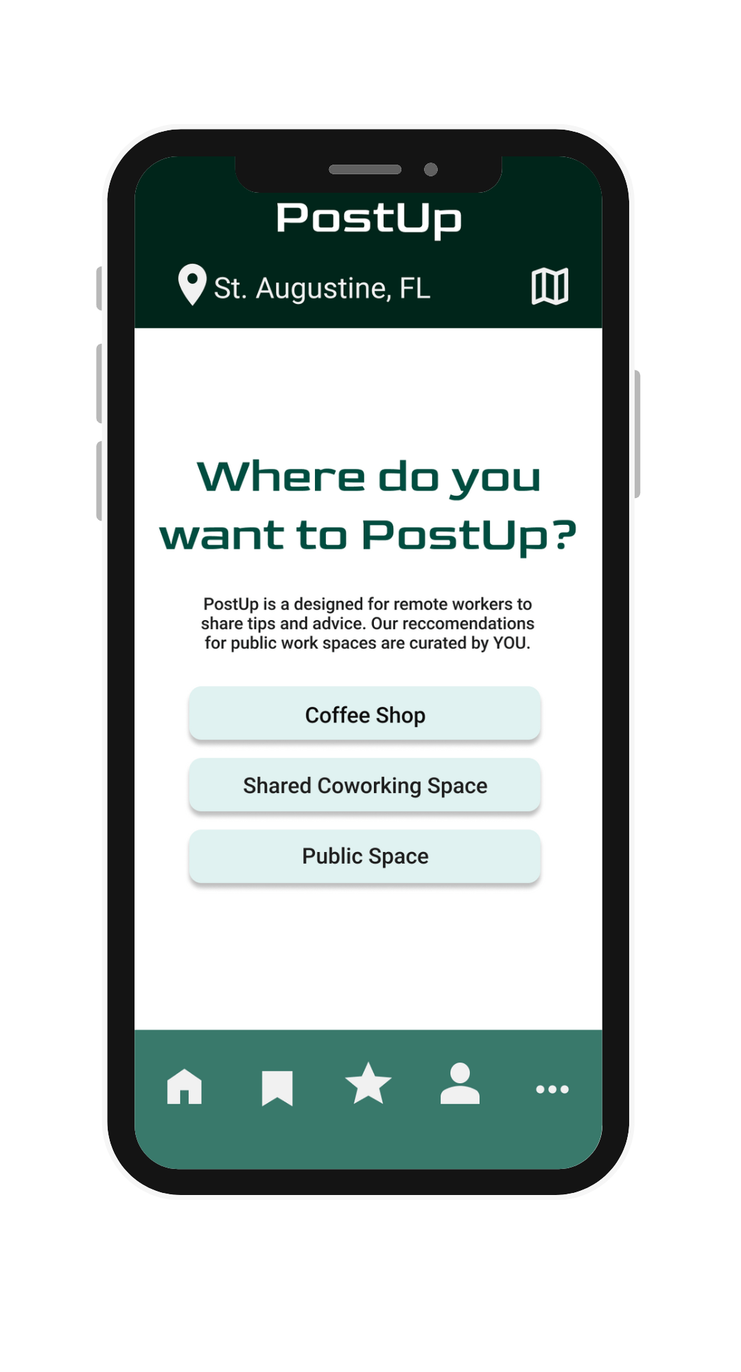
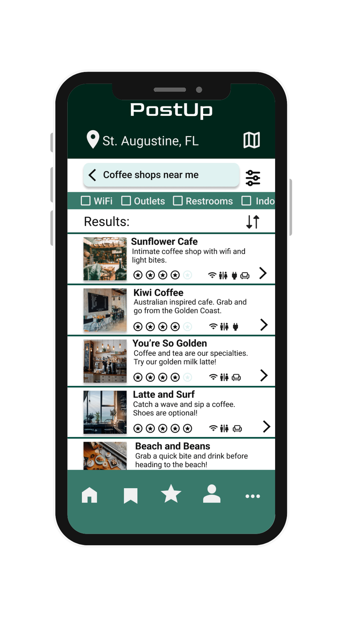
On day 4, I designed realistic prototypes in Figma to depict the new search feature in the PostUp app. Elements were strategically chosen for this design that connected back to initial research and interviews. The search features in the app allow users to select what’s most important to them, pinpoint their exact location on a map, and expand photos and reviews of the potential work locations.
-
![remote workers app]()
Choose Your Space
-
![app high fidelity mock-up]()
Recommended Locations
-
![app high fidelity mockup]()
Business Page Expanded
-
![]()
Added to Favorites

Day 5: Test and Validate
After designing a prototype for the PostUp app, I conducted 5 user interviews and usability tests. Each of the 5 participants were either current remote workers or hybrid workers. All of them had worked in locations outside their home before. When asked where they currently find ideal locations to work from, participants mentioned social media, word of mouth, and Google maps as their top information sources.
Through the tests, I found that users valued the ability to filter through options and find the exact type of location they are looking for. One user stating, “An app using this kind of refined search feature could really change the game for me and other remote workers.” In addition to this feedback, I found that some of the features in the app needed to be modified to be more efficient, since remote workers are often on the go and typically make decisions quickly.
One of the key changes I made from the prototype to the final design was modifying the “save” and “favorites” sections. Through testing, I found that some users confused the difference between the two buttons, so I took the “save” button away altogether. I expanded the “favorites” button so users can see the list of places they have starred as favorites in the past. This shows more efficiency in the app.

Interactive Prototype

If you’d like to access an interactive prototype of the PostUp app design, click on the image or click HERE to launch.
Results & Next Steps
This project was a sprint assignment that showed me the importance of researching and designing efficiently. Often times in real-world assignments, there are crunched timelines and deadlines. Exercising my ability to think and act quickly reassures that I can design with a purpose and iterate designs as needed within a designated timeframe. I enjoyed the brainstorming and critical thinking this project required.
If given the opportunity to continue working on this project, I would love to design more iterations of screens for a paid subscription version of the app, as well as incorporating a social element to the app that connects the existing chat forum to the search feature.